


Icons + Infographics
Our icons and infographics are an opportunity to present information in a visual language consistent with the Creighton voice. These icons and infographics are created to live in the same world as our illustrations, but operate with functionality in mind. This means they are simplified forms that should always be monolinear.
General Icons
Icons use a consistent monolinear approach. We use the circle shape as a container to make the overall shape/body and space uniform from icon to icon, and because it’s a shape that repeats itself often throughout our brand.
Stylistically each icon should break out of the circle container in some manner. Every icon designed for our brand’s icon library adheres to the same stroke width and corner radius for brand consistency throughout.
Icons can be found online at: bit.ly/CreightonIcons
Detailed Icons
Our detailed icons are adaptions of our architectural and crest illustrations. Unlike the general icons, these are held in a shield and window container, respectively. They are used to convey the overarching brand instead of specific programs, audiences or ideas.
As these icons are finer in detail than the general icons, they should be used in larger sizes to maintain a consistent line weight.
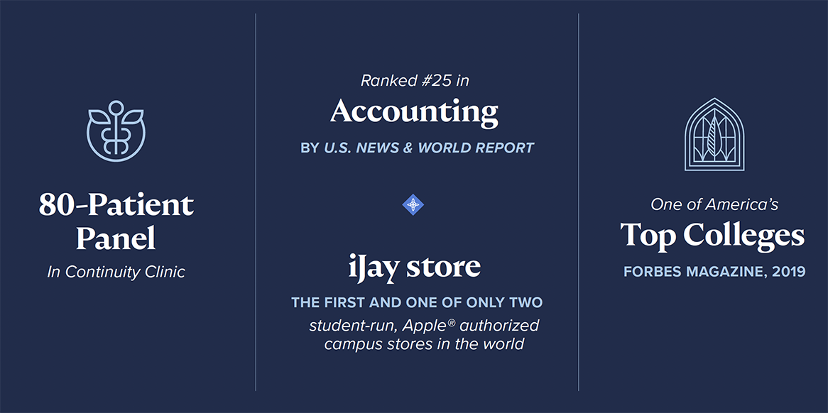
Infographics
When paired with copy, the connection between icon and information should be clear. Our infographics should place emphasis both on the “stat” number and the qualifier. As a rule of thumb, numbers should be set at 5–15 pts. higher than the qualifier and 25–35 pts. larger than the body copy (depending on the size and the medium of the piece).
Charts and Graphs
Our charts and graphs should emphasize our primary color palette but can integrate our secondary and accent colors when needed.